Spice Up My Life


Spice up my life is a story about a fictional Indian girl who is on a path to self-discovery. She uses various spices to change her luck. Indian culture is very aphrodisaical in nature and every spice elevates a different outcome in our lives. This is the thought, from which our story originates. Sabina, our character, is an odinary girl from Delhi, but when she gets left at the altar, she decides to leave and travel the world as no other Indian girl, her stature would do. Her journey is full of suprises waiting to be read. Along with her story, find her recipes, all with a trick and discover the spice you need to change your life.

Aesthetics:

The aesthetics of website building was probably the toughest part of our project. We actually managed to design more than one website and put it up for peer vote, to help us decide. We had one that had a very commercial look to it. It was aesthetically perfect but it wasn’t warm and inviting for our viewers. Which is what a BLOG must be. The other website was much plainer than the first and probably ignored some aesthetic rules. But at the same time, it gave out a warm bloggy vibe. In the end, that’s the one we decided to go with.

The points we kept in mind while building this website were white space, pastel colours to act warm, keeping in mind the emotions of the story, easy accessibility, better interface and easy maneuvering. It was very important for us to give it a personal aspect and that is what we wanted to reflect through our website. It is the one point we kept in mind throughout.

Content:

Coming up with this story was a long process but I think it represents a part of us all, i.e. Warren, Sabine and I. Mixing all of us into one character was a tough but very interesting job. We decided to treat this story as a website/blog. With a total of ten blogs, released periodically, chapter by chapter, our story unfolded with a new recipe each time to engage our audience. It wasn’t just a story but also a recipe search site as well as a study into spices of India and the qualities they exude.

Every blog starts with a personality or adjective that Sabina thinks she needs to add to her life. Then we tell you the story covering why she needs it and end with her special recipe. An example of a spice and it’s personality is cinnamon which stands for love. Both Sabine and I have travelled India largely and the story tells some experiences taken from our lives, while Warren, as a nurse, has always worked around Indians and was able to relate to this girl. We had a lot of fun with the story and even got together every week to cook a dish used in our blog, so we could photograph it.

We all wrote our blogposts individually but then edited it together so as to have one voice for our character. I think this really helped us and solved a major problem of a common voice that we were facing in the starting.
The entire blog is copyrighted by law through the builder website called Wix. Our copyright mark is situated at the bottom of the website. We decided not to use creative commons for this one and all the content generated has been done by one of the three of us and is legit.
The main aim of the story is a message to all women in India to follow their dreams.
Technology and Social Media:
We used a website builder called Wix which makes creating websites much easier. We were able to design every thing to the very last detail which gave us a lot of control over what we were doing as well. On the home page, we put a timeline which tells you the linear format of the story but also the recipe in each chapter if that is all you need. This makes maneuvering much easier. Also a search bar is situated at the top right which lets all search the website. Each post is tagged appropriately. You can view all of our fictional character’s social media on our website and even read a summary on the about me page. An Instagram page, Facebook page as well as Twitter page were designed for our characters. We had numerous friends who followed our posts and kept advertising her website on her social media as well as ours.
While Sabina’s social media posted everytime there was a new post, our pages were used to spring the project and marketing image to our friends, calling them to visit and subscribe. We also sent out two newsletters to all our followers at the start of our project as well as at the end, calling them to view and follow our story.
Marketing Image:

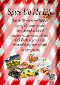
marketing image

I designed the marketing image and am actually quiet proud of it as I think it’s very warm, welcoming and aesthetically correct. It reflects our theme as well as sets the cooking mood that we want to inspire.

We posted this image on all of our social medias to hit as many of our audience we could. The use of hashtags should also hopefully pull more viewers as the hashtags that we used were ones I discovered during my hashtag research for the class.

Team Work:

As I have mentioned before, this project was the perfect collaboration between my team members, Sabine and Warren, and I. We were all part of everything as a team but also had our personal roles defined. Sabine took part in the overall look and design of our website. Warren was boss of the content whereas I made sure of all the copyrights, widgets and apps on our website. I was also part of social media along with Sabine and Warren, all of us taking a platform each. I would say that we divided according to our expertise but ended up doing a little bit of everything.
Though it may not reflect to the normal eye looking at our digital story but every last detail has been thought of including the lengths of the blog posts and it was and could only be done through great team effort, awareness and togetherness. I think I had the best and most vocal team to work with.
Overall, I think it’s a project all of us are mighty proud of and have worked very hard on. I just hope everyone enjoys it as much as we enjoyed making it.
Content

A major problem that Warren, Sabine and I faced was what should be added to our content apart from the main story as well. Should we have some audio, music to set the mood and personalize it further or should we add a few videos to demonstrate our recipes as we were cooking them ourselves anyway. We thought of adding photos of both the recipes and personal photos of Sabina as this was her blog and her story. Then we decided against it. All in all, there was a lot of things that could be done and were thought about in the form of great ideas but it was always a tough choosing how much should be done and how much was enough without over-complicating it for ourselves as well.

Another problem we faced with content was having one voice as it was a story of one person that we tell, from her point of view. All our writing styles differ and it was hard to get a flow going with our content. It ended up being very disruptive in our first draft of the story itself.

To un-complicate the process for us as well as get some good answers I turned to RMIT’s amazing library where I was able to pull some great academic writings which helped me solve my answers.

Digital Storytelling: A Creator’s Guide To Interactive Enteratainment by Carolyn Handler Miller was a great read that I found in the library. Truth be told I just skimmed through it but what I learnt from this book was that, if storytelling is done using socail media, using realistic characters who can be very relatable are more often than not more popular amogst the market online. Also authenticity is craved amongst people on social media and the more the character comes out of real life, the more success. One must concentrate on the character themselves as well as what is trending. you can find more information related to this in chapter 9: Social Media Storytelling.


Review of a few projects

In this blog I have reviewed a few of my peers’ projects. Our CMWP projects were based on India and the culture there. It is really interesting to see what other people have come up with specially as our class is so multicultural.

1. 7 Days of Yoga

This blog page, created by Cassie, Shane, Peter and Tessa is a really interesting read. Having gone through it, I really enjoyed it. Yoga being such a great part of our culture, it’s really cool to see people all over the world embrace it. https://7daysofyoga.wordpress.com/

Some positives for me in this project were:

1. The content does not only revolve around the 7 basic stances that you can do to start learning yoga. I love that there is so much content about the history, what to expect upon doing yoga and the objectiveness of it all. I like how varied it is and I think a person can access this blog even when they are not just looking to add some basic yoga to their lives. I think it is very thought through and more than you would expect to find.

2. I love the photographs. Cassie is so beautiful and her poses are perfect. Just seeing these photographs can push someone to start yoga. They can be intimidating but at the same time, the one’s at the beach add to how yoga ca be fun and not just about spirituality.

3. It is simple, purposeful and fills out every aspect of our project. Most of the other projects have really gone out and done up their look and aesthetics more than the actual content and this project does stand out in the crowd.

Some weeknesses according to me were:

1. Aesthetically though simple, which I liked, I realized just how much you have to scroll down to view the blog and there is no simple way to access certain things. The site being about yoga should be made in a way where the reader can stay calm, if that makes sense.

2. The blog design itself, I would like to subtract the amount that’s happening there. I would have liked to see something around how Cassie’s original blog page is. That is beautiful compared to this. I understand how much content went in but it would have been nice to see some aesthetic components.

3. I would have loved to see some video’s to show me how to go about stuff as well as a great marketing image. Though photo’s have been used to pull people on various social media, a campaign or slogan or a more proffessional approach could do this website wonders.

I think I would just change the website design here to enhance what I want to sell and try to get one marketing image instead of using various shots.

2. Difference is beautiful

A trailer made by Francez, Dominic and Olivia, Difference is beautiful is well, beautiful. https://www.youtube.com/watch?v=EqrC2Bo0NTI&feature=share

The strengths:

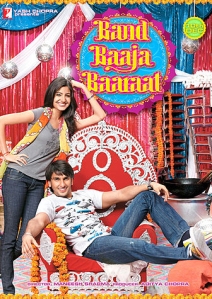
1. I love the aesthetic quality of the video. It is beautifully executed. The animation is perfect and colourful to keep you interested. The music is lovely. Overall, Aesthetically and technology wise I think this is a very high class production. I have posted a poster of an actual Indian film below, a blockbuster, which this trailer reminded me of. To be able to do that is amazing.

Band_Baaja_Baaraat_poster

2. I love the idea itself – Difference is beautiful. Being in a new country, it is really this difference which brings us close and I love the idea of it for a film.

3. Good editing mix.

Weaknesses:

1. The content was not enough to satisfy my curiosity, do justice to the idea itself or even pull an audience. It was lacking a storyline which would entice someone to actually watch it. Could have been so much but was sold short and generating only a one minute video was definitely not enough. I would have liked more with a deeper story there.

2. The gestures used were silly. Could have been more thought of. The story runs differently from what is actually happening on screen which wasn’t too cool, I would say. More structure would have been nice.

I would definitely want to do more research on simple Indian or Chinese gestures used. Even go into more in depth general gestures. An idea would be to use elaborate actions and maybe even drawings. I would also try to make my shooting background more colourful to give me less contrast when switching between the animation shots and filmed shots.

3. A taste of India

This was just hilarious, a good way of forming an ebook/comic strip. http://www.booksie.com/literary_fiction/short_story/taste_of_india/a-taste-of-india

What I liked:

1. Easy to upload on any device. Good Technology, which definitely makes it stand out and you don’t mind giving extra time to read it. I think booksie is a great platform and would definitely like to use it in the future. I read it on my mobile device which was great.

2. I think the way it was handled, it is really comical. I had a really good time reading it and laughing with my friends. I think that’s a really hard thing to do and every little thing added to it. The photos, the cut outs, the slangs and the absolute bizareness.

3. I also really like how indepth the knowledge of the Indian culture, traditions as well as relationships are to the group. It shows through the story.  I think it is great for an Australian audience. Being able to make a story about one culture and sell it to another is commendable.

Weaknesses:

1. Horrible cut out’s. Could have been smoother.

2. Some of the slangs were really wierd and I did not really understand.

I would maybe do more research on India and definitely explore my skills with using tachnology more. Though that might take away from the comic value that they seem to be aiming at now, I would like to be more perfect with my job.

Well, these were the three I saw and decided to comment on. Looking at all of them helped me add to my own project because I wanted to be as in depth as 7 Days of Yoga, as colourful and Indian as Difference is Beautiful and for an audience from different cultures like the Taste of India. I have tried to achieve that and am looking forward to what other people think about my project.

It’s Quick. It’s Easy. It’s Absolutely Free! Skype Conferencing

It can be very hard for a group of people who work together in one of the many facets of life to take out common time to meet, outside of their already allotted time. Hell, my group has been trying it for two weeks now with no success. Who knew everyone is so busy?!

Last night, Warren suggested that we just sit online, which we do anyway, like all the time, and just call each other. We decided to use the conference call feature on Skype. This is how it went…..

I got a message saying to be online on Skype at ten in the night. I made it, no pressure. So did everyone else, even Fleur who was at her bar job in Geelong!

All you have to do to initiate the call is click on the group icon on the left hand side of your messenger, add your friends to the group (drag and drop, doesn’t get easier than that) and press the call button.

So, we started out, getting straight to the point. What are we going to do about this project?? We all had a myriad of ideas which were just all over the place – Fleur wanted to do cuisines, Warren was set on music, Sabine wanted to do travel and I, well I like fiction – a mix of comedy and some hardcore drama.

On Fleur’s end, it was a little noisy, so she ended up muting her microphone and just typing out in the messenger. Yes, you can do that too….send out IMs to your group members while you speak to them. It was really helpful because we got to share links of videos and blogs which we thought were great examples. I even wrote down some words I had difficulty pronouncing. It was so much cooler than a normal phone conference call.

You can also add people later to your call, same drag and drop method. This is really helpful because it can get tedious redoing a call every time someone wants to join in.

But, it wasn’t all dandy. Skype can also mean you need perfect connectivity, updated messengers, perfect working order audio and video wares. Like dealing with the background noise from the bar till we decided to mute out one person entirely was painful for her. Sabine has bad connection as she lives out really far. But, if these issues are not something you are likely to face it, go for it!

We did end up coming to some conclusions and narrowing down to mix all we wanted in one idea…for which you just have to stay tuned!