Pine Point

http://pinepoint.nfb.ca/#/pinepoint

Story elements:

Events – Pine Point is the story of a town. A town that no longer exists and was wiped off the face of the earth. It now only lives through the memories of the people that once belonged there. The story is told through their memories, through the photos, through the news events that took place there. The web documentary takes us through what the town stood for, what it meant to people, the kind of people that existed there and what lead to it’s final closure. It is a look into the town history, the people, the present of those people, the crash of Cosmos 954, the work available in town, the souvenirs which include the photos and videos, the weirdness of how the closure of town was went about and finally what remains today and how people pay their memories a visit every now and then.

Actors – The characters here are a few of the people who were the last to grow up in the town of Pine Point before it shut down. They include the beauty of town, the muscle, the brothers etc. The narrator is someone who did not belong to the town but is a link between everyone now in the present.

Time – The events start in the past when the town existed and run into the present showing the viewer what remains now.

Place – The town of Pine Point. In Pine Point school, hotel, ice ring, etc.

Narrative elements:

Ordering – The events occur in a chronological fashion mostly as we go from what the town was to what remains. Flash backs are shown through the memories and left over footage collected over time in the town.

Pace – The documentary covers various years in about 40 minutes give or take. It touches on the main and most important events and hence, I would say is fast paced.

Focalization – The point of view is through the eyes of an undefined character who might have belonged to the town.

Narrator – The narrator is representing the people of the town. He sounds like an insider but is an outside. He is very reliable as everything he says, through copy only, is backed with images, drawings by people from the town or consensus and research which is very apparent throughout the documentary. He creates an atmosphere of belonging with his attitude of obviousness, which makes the audience more involved emotionally in my opinion.

Text – It is an interactive, graphic digital narrative project created as a website.

Traditional narrative features:

Linearity – The project is mostly linear recounting the way things happened as Pine Point came to it’s end. Every now and then, the narrator jumps into the present but goes back to where he left off.

Series of conflicts that leads to a climax and resolution – The lack of ore resources for mining creating lack of jobs, the crash of Cosmos 954, the burning of the high school and the increase in problems like alcoholism, marital break ups etc., leading to the choice of the government to close down the town.

Protagonist and antagonist – The protagonist here is the town itself – Pine Point. The antagonist is the government who close it down, sending letters to people containing consensus that they wouldn’t know existed, and making them move out.

Three-act structure – Act 1: An existence of a town, doing fine, with it’s ups and downs. Act 2: People leaving, conflicts, school burning, crashing Cosmos 954. Act 3: Closure of town and the memories and way of celebrating it today.

Heroes journey – The hero being the town, through the ins and outs of various life that existed there.

Digital narrative features:

Numerical coding and modularity – This webdoc has a lot of features like animation, graphics, sound, film, photography, scripting, coding and designing etc., which would require a pretty big team of people with collaborations between various professionals.

Variability – Though the webdoc is very interactive in nature and there is a lot every viewer can do and find out, the end result of the documentary is not variable and will be the same every time.

Programmed elements – Interactive maps, timelines, photos, animated characters, videos, animation of the town itself, etc.

Participatory aspects – It is very interactive and every slide has a lot of things that a reader or viewer can do. From clicking buttons to move stuff around or reveal what a drawing means or even explore a township to shuffling through photos and videos of the people of the town. It is participation to find out more over participation to leave your own thoughts behind.

Take your lollipop

For this blog post, I have reviewed Take this Lollipop, Hurst and The Wilderness Downtown, on the basis of their funstionality, visual design and structure.

Take this Lollipop

Probably my favourite of the lot, Take this Lollipop is designed to be an interactive horror film which uses information from the viewer’s Facebook Profile.

Functionality:

This short film has no real reason other than entertainment. The functionality is very simple. The site has been built using HTML5 and is a short sequence of scenes which have been shot prior to posting. These scenes remain the same. All a viewer has to do is connect his or her Facebook page to the website. There is no further direct interaction. It turns into a personalized film which I particularly think is very cool.

Visual Design:

Visually, the film is shot with very good quality which makes it more cooler. The visual design is done with HTML5 and the effects like the lollipop with the razor inside on the homepage are really cool. The visual design goes hand in hand with the functionality.

Structure:

The structure as mentioned before is fairly simple. The website first asks you to connect with Facebook, from where it then uses information to screen a personalized film. It is a short horror film, where the sequence has been shot beforehand and does not change with different profiles. It uses photographs and location from the facebook profile to tell the story of a staulker. In the end it chooses a friend of your list and calls that person the next victim, hence asking you to share the media.

Hurst

I enjoyed Hurst a lot because it was very different. The author of this story used tweets as a way to communicate the story, hence uploading bit by bit every few hours. I think it is an amazing feat due to the character limitations on Twitter. We have seen diaries come alive as books before but how cool is it that she did the exact same thing with an online diary of sorts, as we treat Twitter.

Functionality:

I wasn’t very moved with the functionality of this story because to me it is quiet a task to go through so many tweets if I decided to read it through. It works only as a one time read, if you come upon it while she is tweeting. A later read also takes away from the spontaenity and excitement of a story. The overall working is simple, scroll to the bottom of her tweets to the very first and read up. Plus it’s free and on a huge platform like Twitter so the reach is amazing. It is very interactive as a lot of conversations are built as per tweet and she gets everyone’s feedback almost instantaneously.

Visual Design:

There is no visual design as such in this digital story. The entire story is told using Tweets and inserting photos or videos using Frog or Youtube, respectively.

Structure:

The structure is very linear, telling one story using three platforms – Twitter, youtube and frog.

The Wilderness Downtown

Awesome. My classmate showed this one to me and I fell in love with it because of the music, the simple concept and the nostalgia it created. I might change a few things personally, but it is fun, even though the real message is lost in all the hype.

Functionality:

This website is easy to use. The first page asks for your childhood address after which a song and a few windows open up. A man is jogging and he is heading towards your given address. The Google maps street view has been used to do this. The reason of planting trees is lost as it becomes an entertaining video in the end and nothing more. It lets you write a letter to your child self in between the shots but this is also pointless. I wish it could have been to your future self and maybe an option to get it posted in real.

The functionality from the viewer’s point of view is great but not from the makers.

Visual Design:

The visual design is very interesting in this particular project. Use of film to show a man jogging to the music is interesting and adds a nice element to an otherwise bland setting. The use of google maps street view to find, jog and walk around the location provided acts as nostalgia inducing effect, which is absolutely cool. The animation of trees sprouting up and birds in the sky are cool but stretched out for too long. The website design is really good with amazing animation happening. It is also made using HTML5.

Structure:

As mentioned above the structure is fairly simple for a viewer but has obviously taken a long time to develop due to it’s various elements. All a viewer is required to do is enter an address into the box and sit back an watch as a man jogs on the streets around that address. After a while of this, the viewer is asked to write a letter to his former self, which is a little pointless and distracting. Once this is done, trees start sprouting up as the man jogs, bringing us to the long awaited end.

From the above projects, I tried to join ideas into my own digital story project. I use Twitter as a platform to pull my clientel. I got the importance and the amount of reach of Twitter by going through what was made possible by Hurst. Using HTML5, I built my own website, using a lot of modern technology, great visual design, functionality and simple usage which I learnt to do from the other two projects.

Raise Your Voice – The making

The making of the game “Raise your Voice” with Tim and Isabel as my partners was a really great time, but it took a really long time as well. Making animated videos for the game was really fun and I got to try out my skills, that I have developed this semester, which was great for me. The app itself was very complicated. It isn’t something we are actually posting on Twitter as we made the game keeping The Loboc Choir in mind and posting it would require permissions we do not have.

What Worked Amazingly:

I absolutely agree with Tim, when he says that it was probably one of the best group to work in. I think we worked really well together and all of us took up the job we thought would be best suited to our skills, but at the same time, we were never isolated from what each of us were doing. I think that is really important when it comes to team activity. I was responsible for making the marketing video, which Tim really helped me out with. The picture used is one he got while he was in Bohol. The song recorded is also both of us rapping! Isabel was responsible for making the decision tree for our game whilst Tim wrote the synopsis and the motivation for playing the game.

The game itself I think is really straight forward and short, which, according to some recent market surveys I saw, works really well now-a-days on social media. The element of being able to share it with yours friends on your timelines is also great and something we can look at going viral, which is our main aim to spread awareness about the group and their impending visit.

I really like that with this game it can be a group of friends who do it together as well as individual, which recent similar apps like MyIdol don’t allow.

Everything has negatives:

The app – Autorap was a little bit nuts to tell you the truth. We used it to create our own song but getting it downloaded on our computers as an mp3 was next to impossible. We could share it on social media, no problem, but the app doesn’t allow you to download your music which I think is not cool. When people have something like this, they might want to keep it with them offline or on their phones which isn’t possible yet.

The other part of course is our lack of being able to share it due to copyright permissions from The Loboc Choir.

Overall, the game in our eyes is a success but it is something we can’t test out just yet. Hopefully, Tim will be able to get permission to do so and we might be able to do what we started. So, we would love to have the chance to invite people to Raise their Voices and be a part of something that has come to be very important to us.

Digital Drawing Techniques (Flipped Lecture)

I am taking an animation class this semester called ‘Illusion of Life’. Most other people in my class are already familiar with digital drawing techniques and software. I find myself lacking in both aspects as I started the class with absolutely no clue what to expect, just a dream to produce animation films someday. Reading the flipped lecture for digital drawing techniques was really helpful for me. I am just starting to pick up on it and I feel like there is just so much to take in.

I have heard terms like vectors and bitmap many times over the years but was never really clued in to what they actually meant. If I wanted some designs which would be more cartoonish or outline or art worthy, I would type xyz vector on search. But that was the extent of my usage of the actual term. Jenny’s lecture explained what it really means. When saving my animation project the other day (vectors were used mostly), I first rendered it with full resolution. The file turned out to be so heavy, it would just not play right! I went back and rendered it again in half resolution, thinking the quality of my work would affected. But, surprisingly that was not the case. Atleast I could not make out the difference between the qualities of the two. Reading this lecture, I realized that vector drawings do not lose quality at different, lower resolutions. That’s when it clicked into place in my mind.

I agree with Jenny that drawing with a mouse or trackpad are just not my cup of tea. I did buy a stylus for my project which was really great. I bought it online for just $20! But, you have to be really careful while choosing your stylus as a lot of the cheaper ones (below $20) have really thick nibs. Some are not compatible with all devices either. Like, the one I bought is great when I use it on the apple devices at Uni but doesn’t work at all on my laptop, which is touch friendly.

Another thing that caught my eye in the lecture was the mention of selective erasing method. If you are using photoshop, what I would suggest is make an outline, and a copy (MUST), as Jenny suggests. Then, there is an option on the right side above your layers which will let you select that outline with just a click. That way when you use the brush or eraser tool, it would not let you go outside the boundaries. Makes for much faster and easier work. I just learnt this trick from my friend, Daven, who is amazing at drawing cartoons and like digitally. Check out his website.

http://www.davenbettridge.com/

All animation film work is generally done using digital drawing techniques. My favourite ones include Ice Age and Narnia.

Here is a link which might add a little to Jenny’s lecture. I found it really helpful. Goes right back to the basics.

http://www.digitalartforall.com/15/what-is-digital-art/

Check out some of these amazing things people have done with digital drawings..

Jim Carrey made digitally by Patrick Brown

By Twentieth Century fox films

A site you can check out where someone has changed the genders of famous cartoon characters (pretty cool!) is..

http://designtaxi.com/news/365021/Digital-Artist-Switches-The-Genders-Of-Popular-Cartoon-Characters/

While all of these are really advanced, I plan on using some digital drawings for my project to create characters for my story as they will be displayed on my blog. I want to do this to enhance the visuals on my blog as I understand that it attracts more audience while it also makes a blog more alive.

Creating the snowflake using CODE – A review

Programming Concepts. Two words which can put the fear of god right into me! When I read this on Jenny’s list of tasks, I thought, well those are the ones I am going to leave out. I did Business with Computer Aided Management as my bachelors degree and every semester, I had to choose one programming language course to study. I dreaded these as I never really understood anything in class and barely made it through the course.

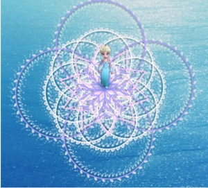
But, when I, against all my head was telling me, decided to open up the link provided, I was shocked. It was amazing and fun! It was nothing like I had ever seen before. After an hour of using code, it was so much fun trying out different snowflake designs. I can tell you now, I realized I’m not as good with maths as I thought I was, but I still managed to create some pretty awesome stuff. The design I finally settled on is displayed below. What do you guys think?

Picture1

I tried various times to get it right and I think I still settled on a pretty simple design. But simplicity beats everything, yea? I really like how this program was displayed with the use of Frozen characters and if you want to learn more, there are different themes up there. I tried making trees using zombies! That was pretty cool.

The reason I think this task really helped me was not the stuff I learnt to do, because I am still not sure how I would want to incorporate using it in my media project, but it really gave me confidence that I can work with a computer, learn different things no problem. This is really good for me because I feel my Bachelors degree took that away from me. I can create, and think of more possibilities now, which gives new dimensions to creativity in my head. It’s funny how these little frozen characters warmed my brain towards trying again. I am glad I did not slink away with my tail in between my legs!